BLOGGER TEMPLATES AND TWITTER BACKGROUNDS

Friday, 26 March 2010

Evaluation - Sam Ferguson

Samantha Ferguson Evaluation
Project: Music Video, 'When Will It End.'

For my media coursework I chose the music video option. In which the task was to create a music video, a mock up album and magazine advert to promote an artist. We had a period of 12 weeks to do this and worked in groups. I worked in a group with 3 other girls in my class, Ivy, Hannah and Shamayla. For the ancillary tasks (the making of the album and magazine cover) we chose to split off in to two groups, I worked with Shamayla in this. I mainly contributed by filming the video, taking photographs for the ancillary tasks and working on In design and Photoshop to create the album panels. I also did a lot of editing in Final Cut Express as I felt I needed more experience in this aspect doing only a print project last year.

As a group we decided that the genre of our music video is pop. This is because it is orientated toward the youth market, usually through simple love songs which is what our song, ‘when will it end’ is. The song was originally sung by Erica Shine, an American rock-pop artist. We found the song on this website >> http://www.jamendo.com/en/artist/Erica_Shine. It allows the tracks to be downloaded and used legally.


According to Goodwin’s six points of conventions, a successful music video needs to include:
  • Genre Characteristics
  • Visuals/Lyrics
  • Visuals/Music
  • Needs to sell artist
  • Intertextuality
  • Voyeurism
So we considered all of these before actually making our video. We also starting thinking about the brand image of our artist and so we researched similar artists such as Taylor Swift, Natasha Bedingfield and Leona Lewis. We looked at the typical codes and conventions found in videos for these artists and found that most of their songs were about love and so the video had to reflect that.

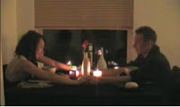
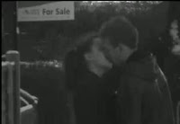
All of these pop videos about love contained similar conventions such as they all had intimacy between the artist and a love interest, or the protagonist and a love interest. So we too, added that into our video. In our video (shown to the right) and Taylor Swift’s video (shown to the left) the intimacy is shown through a kiss. We chose this connotation of love as it is probably the most powerful because it shows the bond between the two people.


The videos also contained something that symbolizes their love. In Leona Lewis’ video it is a heart on fire, giving connation’s that the relationship she sings about is fiery. In Natasha Bedingfield’s video, red hearts are shown throughout, symbolizing the love that she longs for.


 In our video a rose appears throughout the video to show that the artist still loves the man she sings about.

A final convention that appealed to us from these videos is that they all tell a narrative. In Leona Lewis’ video the narrative cuts to all different relationships, some good and some bad. Similarly, our video contains flashbacks as we thought it would portray the story of the song better and some viewers could relate to the situations. In our video the flashbacks are in black and white, the connotations of this are that they are in the past and she misses them. Also, we have flashbacks of her good times and bad times throughout the journey of this relationship, for example:


We see her walking with her boyfriend


We see her walking alone


                          Similarly in Leona Lewis' video we see happy couples together


                      And we also see couples splitting up and people alone


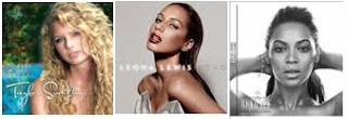
Our ancillary tasks also establish that our artist Eloise belongs to the pop genre. The front cover of the album contains pink font and a pink flower; this will appeal to the existing audience which is young females. Below are some album covers for other successful female pop artists. All are very simple with just the name of the album and artist and also a simple photo of the artist.


We decided to go against these conventions and not show Eloise on the front of the album as it worked for many other artists such as


Although these artists are not similar to Eloise we thought it would be good to try something different as audiences like the ‘same but different.’ This means that they will always go back to a certain genre but they do like something different to keep the genre fresh so the audience does not get bored.

We also used typical conventions of a love song video by using a typical prop, a rose, throughout the video. It is vital to use typical elements through the brand image of an artist because the audience for pop music already exists and they revel in the familiar. This can be proved through Graeme Burton’s ‘Circle of Pleasure and Profit.’


This diagram makes it clear that there is indeed a tight relationship between the media industries that manufacture genre products and the audience.

Scribdddddd

Our innovations are likely to prove successful because other artists exist like Eloise, such as Leona Lewis.


 Leona Lewis is a successful and classy pop artist. She has a recognisable brand image that appeals to all females. However, we believe Eloise will only appear to a younger audience as she is young herself.
Eloise also has something new to offer as she plays her own instrument. This gives her an edge as not many other pop artists out there do that and this again links to the ‘same but different’ theory.

I believe that our choices did work effectively as when answering our questionnaire people commented on the fact that Eloise brings something different to the pop genre. There were also comments about how her albums link to the video to show that both clearly belong to that artist.

The brand image that we wanted to create for Eloise is that she is a sweet, young girl that sings songs with a lot of ideologies about love and relationships. We want her to be someone that other young girls can relate to, perhaps similar to Taylor Swift. Although Eloise’s songs and appearance would be more elegant than Taylor Swift as she specializes in country music.


Our logo is very simply, Eloise’s name. We thought this would work well as it establishes who she is and isn’t too extravagant, we made sure our logo was elegant and simple, like our artist. It is in a simple font called, journal which we found on http://www.dafont.com/search.php?psize=m&q=journal. It is a helpful website as it contains many different fonts to choose from and you can preview what your text will look like before you download.

We chose this font because it gave connotations of ‘girly’ and ‘pop’. We then made it pink to further present that she is to be associated with young girls, and pink could also give connotations of romance. This fits the artists brand image because it is sweet and youthful.

For the magazine advert we decided to use Hannah and Ivy’s ancillary tasks and so the logo had to be altered so that it could be associated with the albums ‘for sale.’ For the magazine advert the logo is in another font which is also very simple, brush stroke std. It is in black with a white outlining to make it stand out.

Branding, Need to Scribd

Branding 2


After researching some media institutions we came to the conclusion that RCA records, within Sony, would be the most likely to distribute our media product. RCA is the name of three different co-owned record labels. RCA Records is the pop music, rock music and country music label. Whereas the other two co-owned labels, RCA Victor and RCA Red Seal specialize in other musical genres such as blues, jazz etc. It is an extremely successful and edgy label with pop artists signed up such as: Kelly Clarkson, Beyonce, Leona Lewis and new pop star Diana Vickers. The link below takes you to the homepage of the RCA website.

http://www.rcalabelgroup.co.uk/
In my coursework project this year I had the opportunity to work on software’s and programmes that I didn’t know of previously.


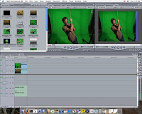
One that we used frequently was final cut express. I used this to do a lot of editing on in which we had to use a tool called the razor to cut scenes to the exact time we wanted them to run for. This is useful when trying to create a music video as lots of short clips is needed. The clips had to be placed on the timeline so we could see where each clip was placed and when it would play and in what order. However, the timeline kept getting a bit jammed and overcrowded as we had a few hours of footage and wanted to cut it down to a few minutes.

There is a variety of good special effects available on Final Cut Express which are easy to use. We used the fade transition on each scene so that the video ran smoothly and there were no jagged cuts or jumps. We also used the black and white filter on the flashback scenes which I thought was a really good tool as it allowed us to make our video look more professional in a matter of seconds.

I did not work on imovie last year so I cannot compare the two but as a new person using Final Cut Express I felt it a very useful package and it was also easy to use once we were all trained on it.

I also used Scribd.com this year to help me present my evaluation. I used slideshare.net last year when I was evaluating my print project and both websites work in a very similar way so I had no trouble with it at all. I think that these websites are really helpful in making evaluations look more presentable.

http://www.slideshare.net/                         http://www.scribd.com/

Last year, for my magazine project I worked on the digital stills cameras and this year I did the same, for my ancillary tasks. However I had no experience on the Canon DV video cameras which we needed to use to film our project. It took me a while to set the camera up at first as I didn’t know how to position it on the tripod or how to place the tape in. But after help from other students and a few times practice I was able to use them effectively and I shot a variety of clips on the video such as close up, mid shot and over the shoulder shots.


A close up shot.


A mid shot.


An over the shoulder shot.


I also used many technologies that I had experience on. We worked on Apple macs which I had worked on last year, and the programmes we used on the macs were Photoshop and Indesign. We used these to perfect our album panels and magazine advert for our ancillary tasks. I like the use of the cutting out tool that you can use on Photoshop as it allows you to freely move the person in the image away from the background, or place them on a different background entirely. A new thing that I learned on Photoshop this year was how to change the colour grader so that the person in the image (Eloise) could stay in colour whilst the background could be changed to black and white.

Indesign was used to place all of our Photoshop images into a frame for a CD panel, this was good because it made everything look a lot more professional and I don’t know of any other programmes that have a set up where you can make an album panel to scale.
I used a variety of different websites during my coursework. Whilst doing research I used Google images, Youtube.com and Dafont.com, we also used Jamendo.com to find our artists song. A website I used the most is blogger. Blogger is very useful for helping keep track of your progress and also allows us as a team to work together from home, via the blog. However, as it is such a popular website lots of people are uploading at the same time and so this can cause a long amount of waiting time when you want to upload yourself.


To conclude, I am proud of our final product as I do feel that it comes close to what a professional artist would have. I think we worked to the best of our ability as students to produce a video on Final Cut Express, some of us having never used it before.

The video works really well with the narrative of the song and also the style of the artist and I think we have made our brand image very clear. However, we could have worked closer on the ancillary tasks so that the brand image was more similar for both.
I do feel that the video could have been better improved with more advanced editing and maybe if it was cut at a faster pace as this would keep the young audience’s attention more.
I feel that the ancillary tasks are very effective too, as I spent a lot of time trying to get them to fit in with Eloise’s image. Although I could have spent more time taking different photos and perhaps experimenting with affects more.





Monday, 8 March 2010


Hannah Greenfield's Music video evaluation.
Group: Hannah ,Ivy ,Sam ,Shamayla
Music Video : “When will it end” Eloise.

My evaluation is of a music video and 2 ancillary tasks that we have created in the last 12 weeks. In the group I worked with Ivy, Sam and Shamayla, together we produced a romantic music video along with 3 ancillary tasks, about a young girl in love, an artist performing a pop genre song.

 "A music video is not primarily a commodity form but a promotional one" (A.Goodwin 1992)

This is exactly what our music video is about, broadcasting the struggle through the lyrics in the song to our target audience and enhancing this with a matching music video. My particular contributions where acting in the project, although I didn't do a lot of filming in the project my particular skills came into use when I edited most of the video in Final Cut.

In our groups we split into pairs and created two different album covers, and a magazine article featuring our album cover. I worked with Ivy when creating our album cover and we each did two pages each , for the group magazine cover Ivy took different pictures to the album cover pictures and we uploaded those which I then edited to find the right look.

In What ways does your media product, use, develop or challenge forms and conventions of real media products?

For our main project the genre we chose is Pop genre. The pop genre was developed in the mid 1950's and it was a softer version of the popular rock and roll genre. Pop music attempts to capture a teenage audience which is the target audience we have aimed for. Genre provides a structure which elements of pop fit into this allows creativity , as long as the video fits in with the basic structure we can still be creative we can add to the pop genre- like the use of a guitar,this allows more to the genre.

The elements we have created to make our music video fit in with the pop genre are distinctive and recognizable like the use of a female artist for a high note slow song. Our genre also has a recognizable protagonist; our artist is captured as a young vulnerable and pretty singer/songwriter. These are typical traits of a female artist working within a pop genre. We felt it best to use an artist and song that was similar to other artists within the pop genre.

Genres change to reflect the zeitgeist, the mood and dominant ideologies in society; this is because if it didn't change people would reject the text. This is why we did not just use a performance but also a story/ narrative. Using a guitar can be seen as more country or folk but we believe that it still fits well in the pop genre as we see it more of a talent our artist has and it fits well in the song. Lady Gaga is a pop artist but uses Whacky and artistic costumes and performances that can be seen as more futuristic but yet she makes it fit well with her pop tracks therefore changing the genre to add different ideas making the pop genre open to a wider audience.


Using Goodwin's six points of the conventions of a music video i can point out the conventions and typical elements of our music video.

 Relationship between the lyrics and the video:  in our video the artist is captured performing the song by singing with the lyrics showing emotion in the body language to fit in with the emotion of the lyrics. 

Relationship between the music and the visuals: the music is not slow paced but not fast and with the frequent change of shots is has the same traits as a pop music video.

Our video fits in well with a particular genre because we have used performance shots which is the artist performing her song but also flashback shots which tell the story of the song. This is typical Of Taylor Swifts video of “Love Story”. From her video you can see that the lyrics fit well with the track and that she shows her emotion of the lyrics while performing in the video.

 Close up shots of the artist : Due to high demand from record companies close up shots are required. Also showing Eloise up close means she can relate well to the audience as they now who they are looking at.


Typical conventions:  are that a music video usually has one or two locations in our video we used the studio for our performance part of the video , but for the flashbacks which is the story/narrative of our video we used three different locations .
  1. We used a dining room for the set of our restaurant shot.
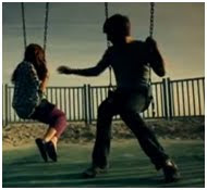
  2. We then used a park, for our lonely shots of the artist by herself.
  3. And for the last flashback shot we used a street for the kiss shot, we feel that the different locations made our video more appealing.
In our ancillary tasks we used two different locations:
  1. We used a studio with a blank wall for our magazine cover because we where cutting around the image of our artist and placing her on a block colour background.
  2. For most of the album we used an outside woodland location as it presented loneliness as she was pictured on her own with nobody in the background , but we also liked the natural setting as this is a trait of our artist , we see her as natural.

Typical characters: are that the video usually features the artist, but not always just like:

This video does not feature the actual artist but features a well known actor which gives the video familiarity. Music videos do also not need to feature the artist at all. With such videos like:


Our video does feature our artist and she is also acting as another character in the flashbacks, as in the performance she is acting as a performer, but in the flashbacks as a character in the narrative.

Typical Narrative: We have found that music videos can include just performance of the artist or band, or a narrative or both so we have used both performance as well as a narrative, this is typical of a pop video because in a romantic love songs its generally about the love or lack of in the relationship between them which we illustrate through the lyrics, music and visuals with such shots of the Kiss shot and a shot where the
 artist is holding hands with her partner.


Typical media language and body language : The media language of the video is shown through the lyrics and the way the actor performs to match the emotion in the lyrics. Her body language is seen as sweet and caring as seen in the two shots above. In the ancillary tasks our artist pushes her posture forward on the magazine cover with a smirk on her face and with her focused directly on the camera, we feel the body language shows her off camera (video and album cover) as slightly cheeky but yet still classy, by the way she is dressed. In Lady Gaga's Paparazzi she uses her body language to match the narrative, at one point in the video she uses her disability to dance in a certain way.


Intertextuality: “music video as incorporating, raiding and reconstructing.”(J Stewart)

This is when music videos often use something with which the audience will be familiar with to create familiarity. In our music video we try to relate to a female audience who may have been through heartbreak themselves but have also had many happier times. For our album cover this is seen as loneliness by the way she is captured alone.

The flashbacks are created to represent the happier memories in the artist's life, where the lyrics of the song are there to represent the heartbreak. Leaving the audience to relate and desire to see what the artist has to offer for their next song of video. The performance shots offer 'authenticity' that what the artist is performing about is real.

Typical Mise en scene: The props and costumes such as the rose and the floral dress used both in the video and ancillary tasks represent the love Eloise has. The guitar shows her talent, and that she loves her music by the way she is playing the track herself. The rose which is used throughout the flashbacks, is a token of the love between her and her boyfriend which we used purposely for the audience to see that the video was about romance. The clock used on the first page of the album cover along with the title on "Loves end" represents that at the stroke of twelve the love she has for her boyfriend will end , it could also be interpreted to mean that her love has lasted long, and it is endless love, until the clock strokes twelve.

Typical Ideologies: A typical ideology is something like love conquers all, which we think our video and album cover promotes.

These artists follow the same genre that we have made our artist in below are video examples.


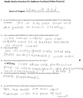
Our audience feedback tells us that the genre is very easy to spot and that the our artist is typical of the genre and that the way we have made the video to fit with the lyrics works well as it shows how we have tried to capture a love song.

"Repition and recognition leads to expectation and anticipation "(G Burton 2000);

This said to mean that anticipation and expectation lead to pleasure , this is why they exist because the audience likes the familiarity. It was easy for our audience to spot our pop genre as they are a taget audience who may listen to pop music as the genre causes familiarity it is why it was easy for our audience to spot our genre. Our audience feedback told us that they did not expect our ancillary magazine cover to be a different sort of image compared to our album cover , but uses the same font and props and the same artist shows the familiar between the rest of our products , so we combined the ;

"unexpected and the familiar" ( G Burton 2000)

There is also a tight relationship between the music industry that manufacture genre products and the audience. Knowing that the audience recognizes the genre, and that they get pleausre from that genre maintains the conventions and meanings of that genre, meaning that they will always like the pop genre. This sets up a saftey net , for if our artist was to produce another song in the pop genre it would be recognized and liked.

When a product is produced it needs certain codes and conventions that fit in with the genre it is aiming for , if the audience recognize this genre they gain pleasure from knowing the familiar, the music institutions like RCA Records then gain profit creating commercial success for the producers which in this case would be our group there would then be repetition in the production of music we make , as we know the audience has gained pleasure from this.

How effective is the combination of your main products and ancillary texts?


Branding is about creating an image that people link to a particular type of product, with an image and message that will draw them over and over again to buy the same particular product. Brands work because they make our artist unique and special.
The Brand image for our artist , is young , sweet and pretty as a female artist and performer this image fits well, and is shown well in the video and the ancillary tasks. Shown by her outfits and props and the way we show her body language.


This image is part of our album cover and shows a very innocent and glamorous but simple image , which is the brand image we are aiming for , it shows a natural image which is what we aimed for.

Our Logo is a simple text of our artists name "Eloise", its a bold but neat logo , it flows well and is in the colour of white , the colour white is the denotation and the connotation is purity and clean. The logo is used throughout the ancillary tasks that myself and Ivy created and then on the magazine cover in the same black and white colours creating consistency. We used a basic font from Microsoft Word called "Brushstroke std", the font is formal , and simple which fits well with our album cover , but with a simple white lining aroung the text it makes it bold , and stand out giving a different look , we feel our font chosen for our artsit reflects the artist as inside like the black she is formal and natural , but yet simple , but when performing has an outline like the white that makes her stand out from the rest. 


The costumes used throughout the video and ancillary tasks are floral and simple , this gives the connotation of lovely which we take to mean love and pretty, we didn't want to over crowd our artist with whacky clothing , we wanted her to look simple as we think this promotes a good image of her. It promotes a more sellable image , as the object f the video is to portray our artist and her voice not the outfit she is wearing.


eloise


Magazine.


We also use a rose prop throughout the video which gives the connotation of love and romance. The shoes worn in the video are black heels which give the connotation of classic , and classiness.


Insitution.
The institution that our artist and music video would be found in would be RCA records which is part of Sony BMG. Sony BMG is a major label. The typical traits of this music institution RCA is that they focus on a certain genre- this being pop,rock and country. Our main focus is the pop genre but there are little bits of our artist , like the guitar playing that can be seen as folk and country.
Although from our feedback , our audience told us that it is typical of a pop love song , i feel that it would stand out from the typical because we have used more than one location and although our brand image is similar to artists such as : Taylor Swift and a young Britney Spears.
Our artist also performs her songs as well as performing the music with a guitar which not many pop female artists do.


Audience

This is the video for our audience feedback. We also took several questionnaires.

Ancillary Feedback.


Use of Creative Technologies - Skills i have learned

Firstly using Final Cut Express this year instead on using imovies means that shots could me more precise and where easier to fit together in a sequence, it also meant that we could use better looking transitions which we used for the flashbacks these looked a lot better and flowed well rather than when creating it in imovies last year. Final Cut could create allsorts of different effects, it enabled us to use transitions that faded different clips into different clips , so that you didnt see an overlap between the flashback shots and the performance shots. Tools like the razor blade tool , gave you a more precise cutting of a clip,which would slot in well with another. One limitation is that if we moved a clip even half a second away from another clip so that we could sync the performance singing in with the backing track , the rest of the clips would then become out of sync. So each time you then had to move the clips up strech them out so that all the clips fitted together well. The timeline also made it easier to see clips and to build a whole sequence on one line.The filters also made it easier to turn our flashbacks into black and white because you could then manually balance out the white with the black.If we had changed the colour on the camara whilst videoing our flashbacks we would have not been able to make either the white or black stand out more.When we first used final cut express it was very different than using imovies so we had to learn all the different controls and tools. When you wanted to upload footage it had to be played on screen at the same time , this ment that we couldn't do anything else at the same time. There where also limitations as we had filmed an hours worth of footage of a clock which we wanted to speed up so that the clip would last 5 or 6 seconds but , final cut couldn't speed it up fast enough and we wanted to fit the whole hour in. So we decided not to use the clock in the video , but used the image with the clock on for our album cover so that the title of our album cover was represented in some way.


Using indesign for the first time for me was very confusing , but after a while its easy to get used to . It is a very good programme as it enables you to edit a picture well. , the filters are fantastic and it gives so much to the final look of a picture.When we has cut our image out in photshop we created our album covers and magazine covers in indesign. For the album covers we loaded our pictures after editing straight into indesign to build the base for our album covers we used the indesign basic CD pack which was the layout we used for our album cover. We then added the detail , such as the lyrics headings , barcode , our black and white lines and placed it all together, which then created our album.For our magazine cover we used a blank A4 layout in indesign and created a plain black background. After editing our image in photoshop we added our cut out image onto the background. We then took the HMV logos from the internet and added them on to our background. We then added our logo which was also used throughout our album cover , we added a short qoute about our artist and finished it off by addind a print screened image of our album cover to the bottem , so that when looking at the album cover the audience know what the album looks like.

The apple macs where easy to use throughout the project and are a lot easier to use than a windows computer because they are bigger and icons are clearer they are also a lot faster so work is done quicker.

 Blogger is a good way of displaying your work as you can see from our blog it all fits well and is clear to use. Although it has it's many limiataions , as pictures are hard to move. posts that have been posted months ago are very easy to find. I have also found it hard to copy and paste and with writing my evaluation on word before i put it on to blogger it wouldn't paste so i then had to type it all out again. Blogger also enables you to edit a post instead of having to delete it and start again , this is good because otherwise i would have to write all our posts back up if they needed editing.


Photoshop also enables you to produce a a good looking edited picture and has many different filters for changing the style of your picture which we used throughout our ancillary tasks as they enhance the image. Creating our ancillary tasks was quite hard with not knowing how to do it before. Firstly we placed our picture on to a blank page.Next we layered the images to create to copies so it was easier to crop and cut our images.We then used the selection cut tool to cut round the image of our artist so that we could place it on a black background which would become our magazine cover we then used a grain filter to make the pixels stand out in our image which gave it a spotty look. Because is was coloured and our background was black , it made the image stand out , and made it more appealing for the audience to look at. For the album cover photos most of the filters gave either a bright looking image or a cartooned effect which we thought worked well with capturing a slightly child like image that our Target audience would relate to , our front cover of our album cover had a picture of our artsit with a clock infront of her face we did use a filter for this and we just cut round the image , we wanted a plain filter as we wanted the focus to be the clock , this being because is fit with the title of our album.


We used a website called jamendo which is where we downloaded our music from this was a very useful website because it explained about the non copyrighted artist about her genre and about the uses and limitations of the track we chose to use. It was also where it pointed out her licence agreement. Which is posted in our blog.


The digital stills cameras are brilliant cameras as they can capture quick emotion shots for example of the fuji camera we used had a setting in which you didn't have to click every time to take a picture , but you could set the camera to catch say 40 frames at once. This was useful as it would catch different moving emotions at once. We also used the camera for our casting shots and prop shots.


The cameras are good cameras for capturing the full video , they zoomed well , and where clear from shot to shot. With the cameras not being major production cameras not everything can be expected of them so the shots where blurry and spotty.(Canon video MD235 E Video recorder)
The camera let us be able to shoot clear close up shots which i think worked well in the project.


Youtube is a fantastic website for viewing videos and uploading , so when we uploaded our audience feedback it took no longer than 15 minutes , it was a very clear image and the link was easy to find to put on blogger. With its huge amount of accessible music it was easy to find artist that we could compare to our artist. Although all the videos we have used don't have an embedding code , which means that you couldn't watch the video directly on the blog , they still came with a link
which can be clicked on an will take you to a seperate window to watch
the example we have chosen.

We also used a tripod which enabled us to shoot high and low shots , when doing our hand held shot which we used to shot around the artist it made the shot less shaky , which if done without would have been a shaky shot and would have been very unclear.( Velbon CX 540 Tripod)The tripod also cam in handy when shooting the 3 minute long up close shot as without it the cameraman would have created a shadow , and the camera would have been unsteady.


In research we used the Internet to research all of our project , there are not really any limitations to the Internet , but it was alot easier to do research at home as my computer had no internet restrictions where as at college there where internet restrictions.


  • http://www.google.co.uk/ - This website is a worldwide search engine and enabled our gruop to research a wide range of material , there are no limitations to google apart from at college , we have also used google for many images throughout our research.


  • http://www.dafont.com/ - Da font is a webiste where you can download a varied amount of fonts. Although we did not use a font from this website it still gave us an idea of what we wanted our font to be like , we then found ours in Microsoft Word.


Conclusion
I think i planned and researched well and as a group covered all aspects , which made it alot easier when coming to write this evaluation. I think that our research has made it clear as to what we wanted our music video to be like and made clear the brand image and genre. Being me and Ivy who spent many hours searching through websites to find the perfect track we thought it best to look into it by reasearching the artists name 'erica shine' to check that it was ok for us to use her track, i then looked into the website jamendo which is where i found the licence agreement for the track ,this then lead us to be able to use the track.

One strengh of our product is that it is finished finally , it has been hard work , there has been a lot of disagrement but this disagreement has motivated us into making the project at its best potential. The shots we chose where a strength as they captured everything we where hopeing for, they where clear and well cut and sinked well with the words. I also think that the transition to which the flashbacks fade into the performance shots is really smooth and you don't notice the shot change. I also think that the lighting used compliments the video well , as there is a purple light that we used which i think made it look very feminine. One strength of the ancillary tasks is that the picture on the album cover which has been cut out from another picture fits well with a plain background and makes the picture standout. We also used HMV logos on our magazine article which made it look really authentic.
Not everything about a project can be perfect and neither was ours , i think we should have added more flashbacks , but we didn't want to over load it. Also i wish that we added more short shots , to give it even more of a realistic feel.

To conclude i think i worked well in the group and contributed many ideas , i worked well at editing the final product as i didn't do much filming because i was the star of the video. This has also given me a lot more confidence. I think that the magazine article i produced really appeals to the audience and with it being the first time i have worked with photoshop and idesign i can say i am rather proud , i have enjoyed helping make a great project and i am glad it was liked in our feedback.